When you navigate to a new page on GitHub (also this website), you will see a loading progress bar at the top of the page. The animation of the bar is smooth and looks natural. I'll discuss the underlying user experience and build a similar one in React.
In this tutorial, I'll use Remix as the React framework. However, you can use any other React framework or library as long as it supports page transition state tracking.
You may notice that the loading progress is not linear. It starts fast and slows down quickly, then progresses in small steps. Once the page is loaded, the progress bar quickly reaches 100% and disappears.
If you check the network tab in the browser's developer tools, you will see that the progress bar is not directly related to the network request, but it's more like a visual effect.
This design is intentional and a psychological trick to make the user feel that the page is loading faster. Let's compare it with a linear progress bar and a traditional spinner:
As you can see, the linear progress bar looks a little bit slow, while the spinner doesn't give any feedback about the progress. The GitHub progress bar gives the user a sense of progress and makes the loading experience more pleasant.
In human-computer interaction, there is a concept called perceived performance. It's about how fast the user feels the system is, not how fast it actually is.
For linear motions, they can often appear abrupt and mechanical, which can be more mentally taxing to follow (more cognitive load). More natural motions, like easing and springing, can feel more predictable and easier to process.
Studies found that smoother transitions can reduce the cognitive load on users, making interfaces more user-friendly. This is helpful to make the system feel more responsive.
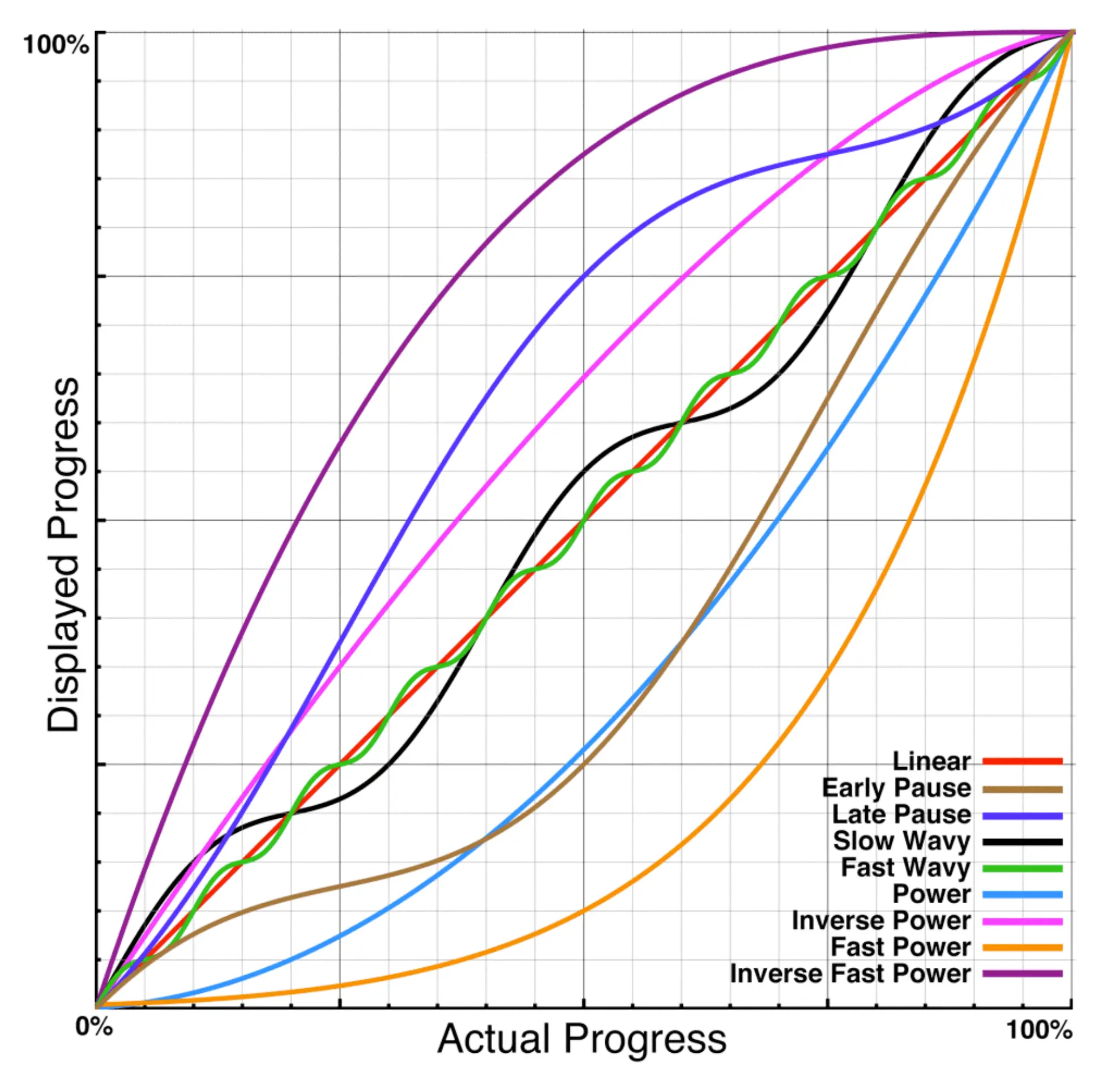
In addition, Harrison et al. (2007) found that users perceive the progress bar to be faster when it follows the "Fast Power" easing function, which is very similar to the GitHub progress bar.
We can conclude that the key to make the progress bar looks faster is to "quickly start, slow down, and then speed up in an exponential manner".
Now let's build a similar progress bar in React. We will use Remix and its useNavigation hook to track the page transition state. If you are using other React frameworks, you can use similar APIs to achieve the same effect.
To make it even more natural, We will leverage spring animation from react-spring to animate the progress bar (this library is already a good example of how physics-based animations can improve user experience). We can divide the animation into three stages:
Start fast and slow down quickly
Progress slowly and steadily
Reach 100% and disappear
With react-spring's imperative APIs, we can easily achieve this effect. Here is the code:
Let's break down the code:
We have a spring ref api to control the animation. When we need to start the progress bar, we call start with the following configuration:
Start from 0% width.
Use a large tension and fine tune the friction to make the progress bar start fast and slow down quickly to 10%. Note we use clamp: true to prevent the progress bar from overshooting or oscillating.
Progress to 15% with a duration of 5 seconds. It's a buffer stage to make the animation more natural.
Progress to 100% with a higher tension and friction to make the progress bar proceed with a slow spring motion (GitHub uses random length of steps here, but personally I prefer a smooth motion).
When the page is loaded, we call end to "intercept" the animation and make the progress bar reach 100% and disappear quickly.
Remix provides a useNavigation hook to track the page transition state. We can use it to start and end the progress bar. Here is the code:
Feel free to customize the progress bar style to match your website's design and adjust the animation parameters to fit your preference. As long as you follow the "Fast Power" style easing, you can achieve the same goal.
Human-computer interaction is really an interesting field. Even small details like the loading progress bar can significantly affect the user experience. In Logto, we not only care about the technical infrastructure and implementations but also the user experience and design. We believe that they are also important parts of a developer-friendly platform.